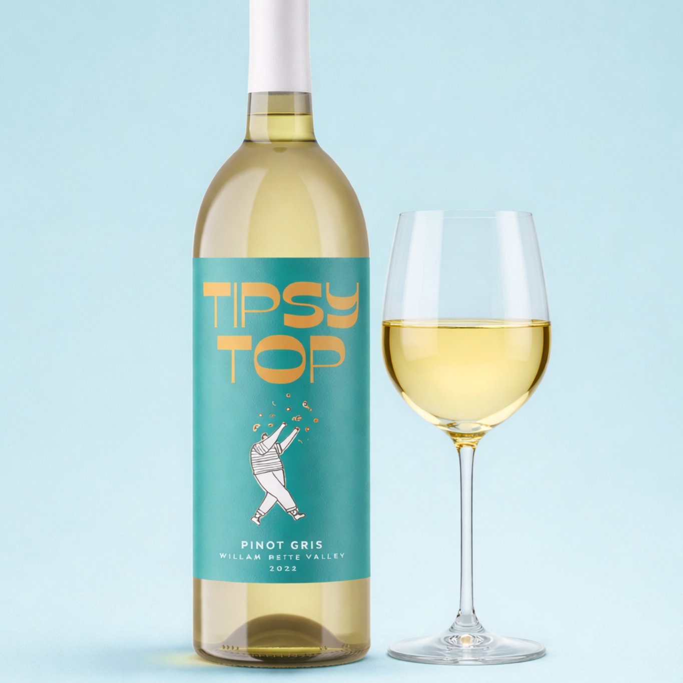

A winery can spend months refining a wine, then choose the label finish in an afternoon. That surface choice shapes what a buyer notices before they read the variety, vintage or tasting notes. Light, texture and small reflective details all affect the bottle’s first impression.
Looking through custom label wine products can put finish options into a visual context, but the wine’s position should come before a printer’s sample book. A bright, easy-drinking rosé needs a different presence from a restrained single-vineyard shiraz. The finish should support the promise already made by the wine, bottle shape and artwork.
What Finish Means
Finish describes the final surface character of a label. It may come from a coating or laminate over the printed artwork, from the stock itself, or from a detail such as foil. It changes how the label catches light, feels under a thumb and presents colour from a distance.
Stock is the paper or material carrying the print, so it isn’t the same thing as finish. A printer may mention lamination, which is a thin film over the label, or uncoated stock, which has a more paper-like surface. Spot UV is another term worth knowing: it is a glossy treatment applied only to selected artwork, rather than the whole label.
The same illustration can feel quite different on gloss, matte or textured stock. Before settling on a direction, ask to see physical samples and hold them against the bottle. A screen can’t show the movement of reflected light or the feel of uncoated paper.
See also How Next-Generation Gaming Technology Is Transforming Portable Entertainment
Gloss and Shelf Energy
Gloss has a reflective surface, so colour and contrast can feel more immediate under bottle-shop lighting. As a print direction, it often works with saturated colour, photography, sharp graphic forms or a confident brand mark. It can make an everyday range look energetic and polished without forcing the artwork to do all the work.
Gloss isn’t automatically the right choice for an approachable wine. Pale inks, fine type and generous white space can lose some of their quietness when reflections travel across the label. If the wine is made for casual occasions but still needs a considered feel, compare gloss and matte samples using the actual artwork.
Matte and Quiet Confidence
Matte has little surface shine, so type, illustration and paper tone receive more visual attention. It is often a sensible direction for minimalist labels, natural or organic ranges, and small-batch releases that need to feel calm rather than loud. A pale label on dark glass can look deliberate when the typography has enough room around it.
There is a design trade-off. Matte won’t supply sparkle to a flat palette, so spacing, type weight and print contrast need to carry the shelf presence. Check small text, pale grey details and fine linework on a real bottle, not only on a bright screen.
Texture and Foil
Textured or uncoated stock adds a tactile quality before a buyer has read a word. It can suit a premium red, a traditional cellar-door range or a wine with a hand-made visual direction. The stock should feel connected to the wine story, rather than like decoration added at the end.
Foil is a metallic treatment applied to selected artwork, such as a brand name, border or small emblem. Used sparingly, it can suit a reserve release or celebratory bottle where one detail deserves attention. Covering too much of the label in foil can compete with the typography and make a restrained design feel busy.
Texture and foil also put more pressure on the artwork. Fine foil lines, crowded lettering and tiny decorative marks may not deliver the clean result suggested by a screen proof. Give the printer final logo files, the intended colour palette and a marked-up visual showing exactly which elements should receive foil.
Legal Label Content
Finish is a style choice, but it sits alongside a separate job: making sure the label carries the required information. Australian wine labels are governed by Commonwealth and State legislation, and Australia’s wine labelling requirements set out the regulatory framework producers need to consider. A matte label with elegant copy still needs compliant content.
Keep the compliance discussion separate from the finish discussion, even if both happen in the same approval round. The printer needs to know where mandatory text will sit, and the winery needs to check that it remains readable against the chosen stock, colour and finish. A crowded back label can alter the balance of the whole bottle.
Further Packaging Help
Some questions sit beyond how a label reads on shelf. A producer may need technical guidance on packaging or other production matters that don’t belong in an aesthetic finish brief. The Australian Wine Research Institute includes packaging within its industry packaging resources.
Bring those technical questions to the right source, then return to the printer with a clear visual direction. That keeps the design discussion focused on what the finish should communicate, rather than expecting a metallic accent or textured paper to solve every packaging decision.
What to Do Next
Start with the bottle’s intended position and the feeling the artwork needs to create. A bright, accessible release may suit gloss and stronger colour movement, while a restrained or natural-looking wine may suit matte or uncoated texture. Keep foil for the parts of the design that deserve attention.
Then prepare a short brief naming the wine, target drinker, bottle style, artwork direction and preferred finish. Ask the printer to show the same artwork on contrasting finishes, then review those samples on the actual bottle before approving the label.